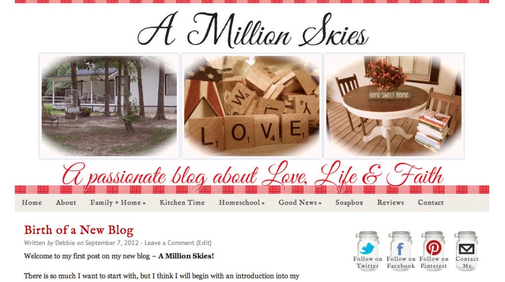
I recently had the privilege of working with a return client, Debbie, to migrate her content from Blogger to self-hosted WordPress and give her blog a new look!
You may remember that I designed Debbie’s old blog, Heritage Creek, and while she loved that design, Debbie was ready to move over to a more robust self-hosted WordPress blog.
So she rebranded her site from Heritage Creek to A Million Skies, and we created a design for her that fit with her new blog’s name and her goals.
One of my favorite parts has got to be the social media icons.
Debbie wanted to keep the mason jar from her old blog’s design, so I thought up a creative way to incorporate it in her new design by using it for her social media icons. Aren’t they cute?
Head on over to A Million Skies to see the new design for yourself.
Thank you, Debbie! It was a pleasure working with you.


I love this design. I need to eventually change my blog over to WordPress. I think that may be my next blog step after BloggyCon!
Thank you, Emily! I’d love to work with you again to move things over. 🙂 I’m looking forward to BloggyCon, and I can’t believe it’s less than 3 weeks away! Woot!
I agree, the mason jar icons are a super cute idea. The tagline font is a nice touch too. Very nice!
Thank you, KC! 🙂
Sandra, another great blog design by you. This design has a very home welcoming feel with a clean and crisp look. I do really like the social buttons too, they are a really nice touch.
Thank you so much, Shelly! I totally agree about the ‘home welcoming feel.’ I love that about Debbie’s design. 🙂