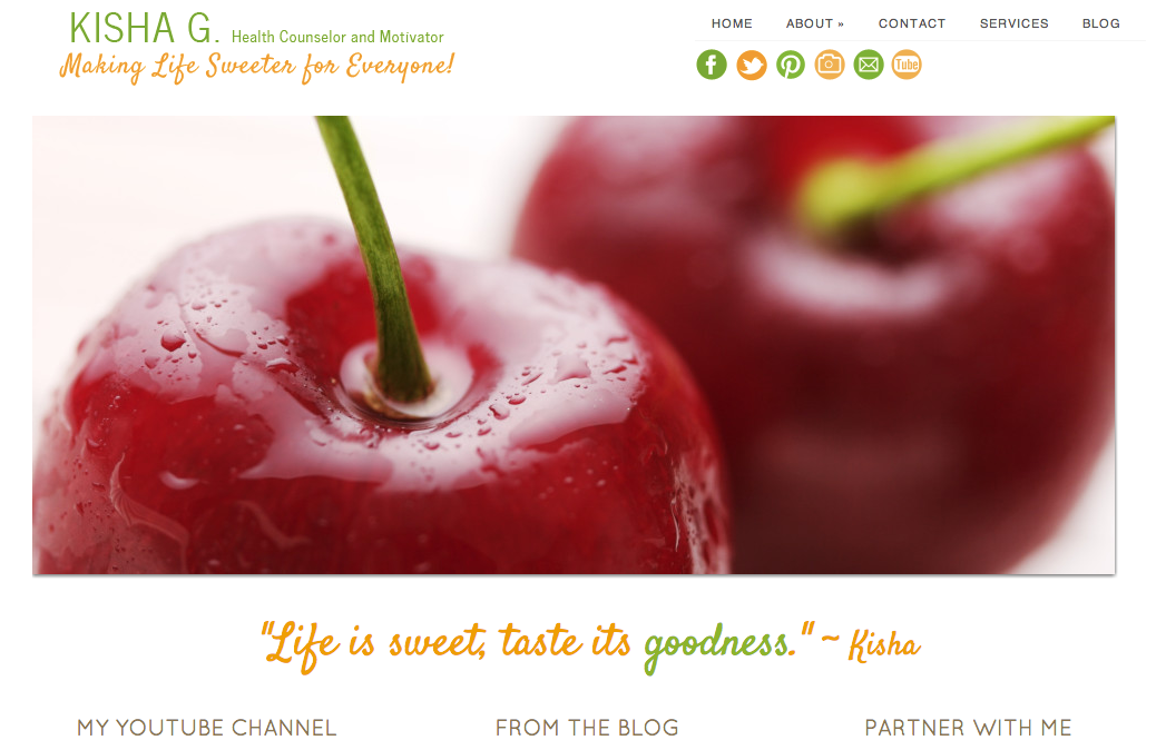
I love simple, minimalist website designs.
I love sites that have all kinds of stuff going on, too, as long as they’re nicely designed and don’t make my eyes hurt.
You know the ones…
Kisha’s New Business Website
Well, I recently had the privilege of working with a former blog design client to create a completely new website for her that showcases her style and expertise as a certified counselor.
The name of Kisha’s site is pretty easy to remember. It’s KishaG.com.
Kisha’s site also includes a blog, and I created a super cute blog signature for her to put at the end of her awesome posts.
I truly love every part of Kisha’s site. I resonate with her style, and I’ll be going to for something simple when I set up a new website for myself at the end of May.
I bought my name as a domain (insert BIG smile as I think about all the possibilities this brings along with it).
I can’t wait to start working on sandracalixto.com. 🙂
But enough about me. Head on over to Kisha’s new site, and see if for yourself.
What are your favorite types of blog or website designs? Do you lean toward lean and simple design or do you favor more magazine style sites?


I like sites that are minimal but also have color on them!
I was looking at my name url as well. debating on if I should get it. I can see reasons why not to and reasons why you should.
Hi Melissa, I agree. I like sites that are simple but that have distinct colors that pop and make that site different and interesting to the reader.
My sister and I are venturing out into the world of becoming social media consultants and teachers for small business owners. We’re planning on teaching classes locally and besides that I want to let people know other services that I personally can offer them as a content creator and social media expert. 🙂
I love the signature you made it is so cute. I like designs with color but not to cluttered.
Thank you, Shelly! I’m with you. I like designs that don’t feel cluttered.